FRWRD Skincare
Like every powerful story begins with a foreword,every powerful day starts with FRWRD Skincare™.
FRWRD is a USDA Organic skincare line made sustainably from potent Canadian forest ingredients. They believe that transparent ingredients, giving back to the planet, and improving the lives of our customers, can coexist in a premium skincare experience.
FRWRD came to us wanting to create a clean, sustainable, premium, and unisex skincare product based around the concept of ritual, self-improvement, and respect for the environment.
SCope
Creative Direction
Brand Identity
Packaging Design
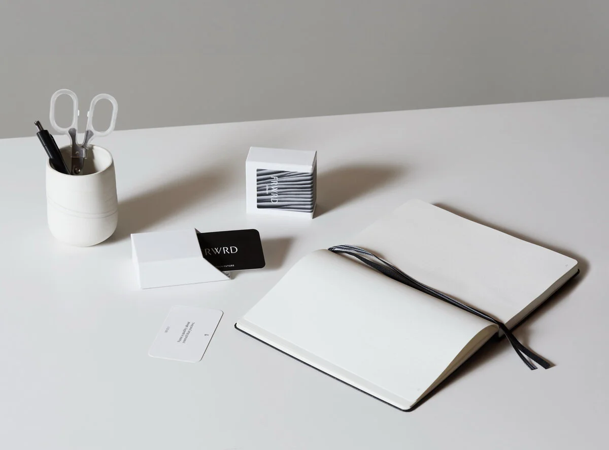
Print Collateral Design
When creating the brand concept, we looked to the past for inspiration.
The logotype is a reference to Roman-style inscriptions carved into stone. The brandmark – a pilcrow – is an ancient typographical character used to mark a new paragraph in written text. The idea behind using this as a brand symbol is to literally and figuratively signify a new paragraph, a new story, a new beginning in one's life. It represents a blank slate and the freedom to write your own narrative, which is a strong theme throughout the brand story.
Super Hero Ingredients.
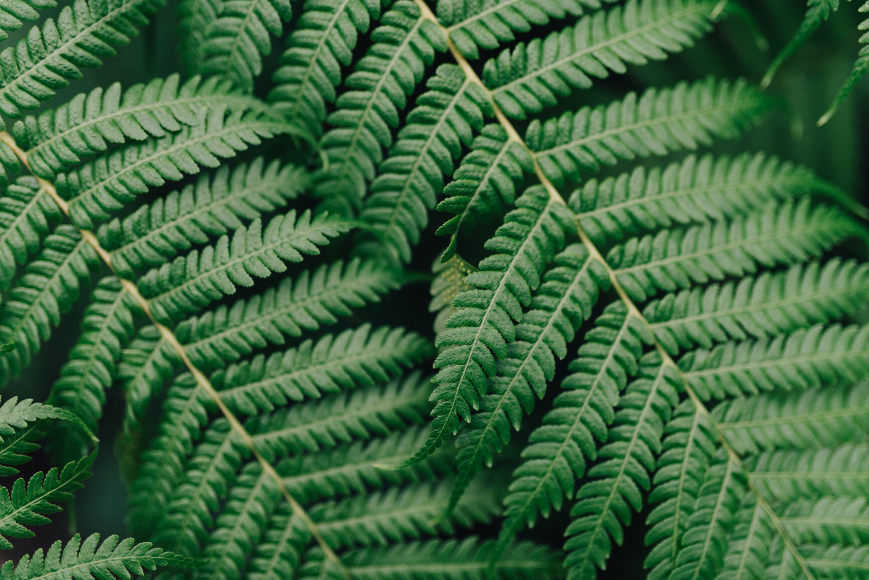
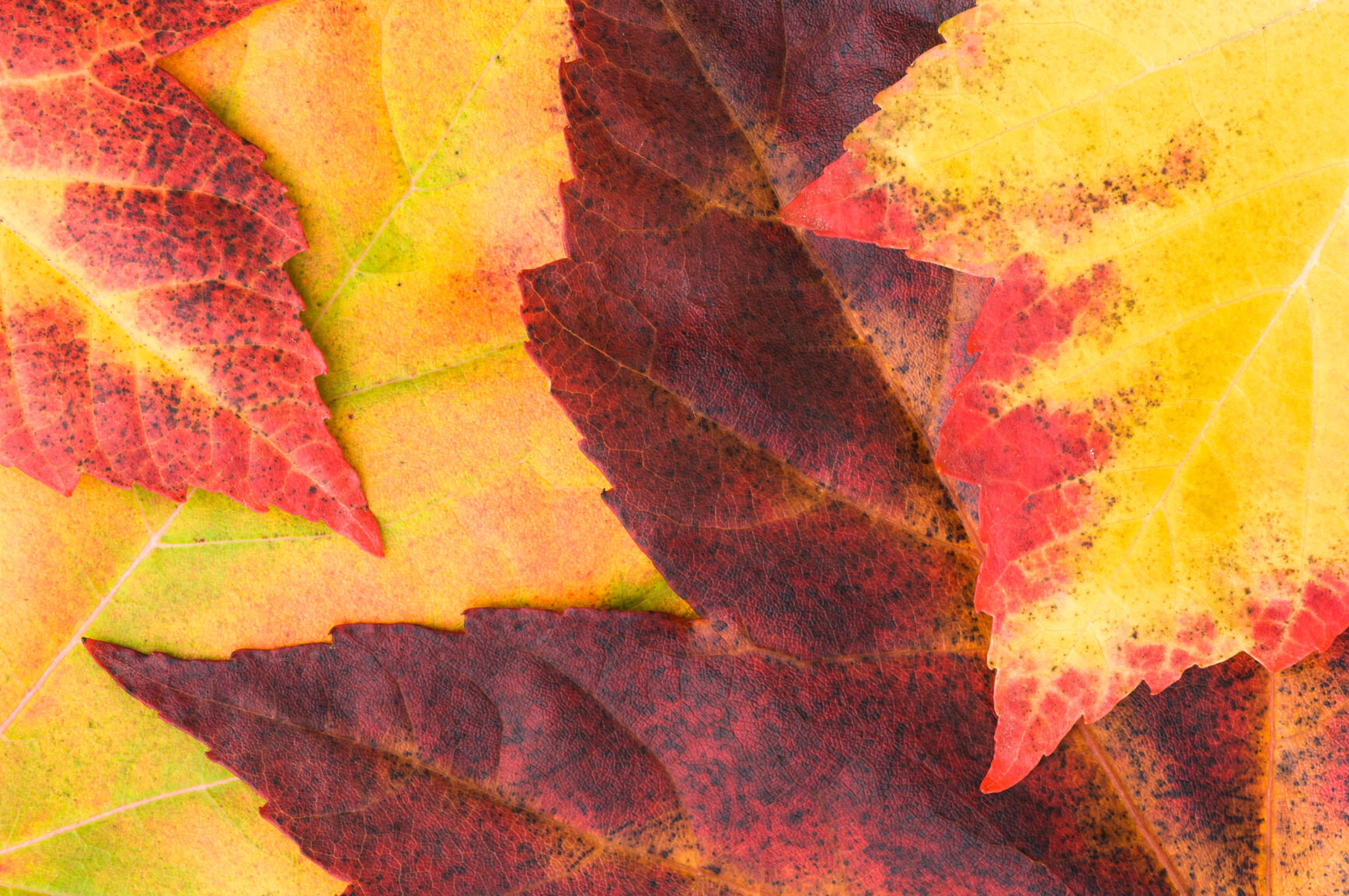
FRWRD’s hero ingredients come from their Northern-Canadian acreage, where the powerful Mushrooms, Maple, Fern, and Moss ingredients are sourced.
They are small batch, hand Eco-harvested and formulated in a Net-Zero facility, allowing the forest to rejuvenate.
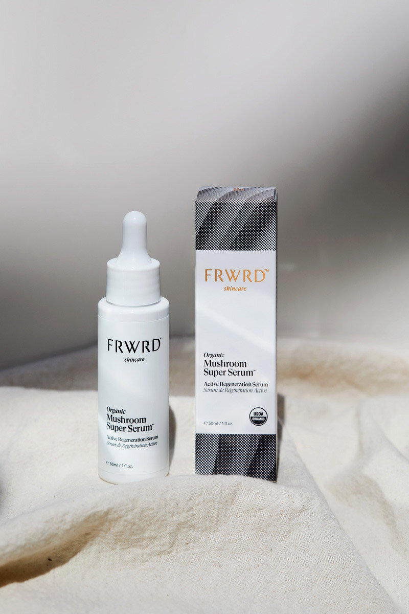
FRWRD's flagship product – The Organic Mushroom Super Serum – features four types of mushrooms, dual maple leaves, fern, and cannabis as the hero ingredients. These natural ingredients were the initial inspiration.
Because mushrooms were the shining star of the product, we wanted to find a way to incorporate their texture into the packaging design. Again, we looked to the past for inspiration. We chose to use traditional image printing methods by applying a halftone process to an image of a mushroom's underside, creating an abstract pattern. This process also allowed us to print the image on the packaging using far less ink than a conventional photo image.
Our goal with the packaging aesthetic was to create a minimal, neutral, luxurious, and inclusive design.
We wanted the final product to feel at home in any bathroom decor and not appear overly feminine, allowing men to feel confident using and displaying the product too.
Working closely with a Psychologist and Neuroscientist, FRWRD has developed a proprietary Self-Care Ritual to help those on the journey to creating a better-self bring clarity and focus towards their life's greater purpose.
“FRWRD does things differently with ritual design. They harness the unique combination of ritual science and design thinking to tap into a set of ancient self-healing behaviours that are meaningful, connected, and grounded.”


